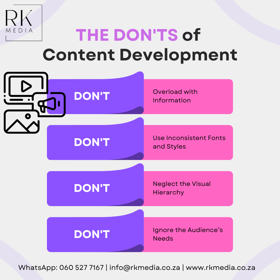
The DON'TS of Content Development

Don’t Overload with Information: Avoid cramming too much information on a single page. Break content into manageable chunks, using headings, bullet points, and visuals to keep it clear and scannable.
Don’t Use Inconsistent Fonts and Styles: Mixing too many fonts, colors, and styles can make your content look unprofessional and chaotic. Maintain a consistent style guide for typography and design elements throughout your content.
Don’t Neglect the Visual Hierarchy: Failing to organize content by importance can confuse users. Use size, contrast, and placement effectively to guide the reader’s attention and make it easy to identify key information.
Don’t Forget About Accessibility: Not designing content with accessibility in mind can exclude users. Ensure text is readable, provide alt text for images, use proper color contrast, and structure content logically for screen readers.
Don’t Ignore the Audience’s Needs: Creating content without considering what your audience wants or needs can result in low engagement. Research your audience and tailor the content to be relevant, engaging, and valuable for them.
